Introduction
Hospitals generate staggering volumes of data every day — clinical records, billing transactions, staffing logs, transport requests, supply chain events. The problem isn't a lack of data. It's that most of it sits in disconnected systems, invisible to the people who need it most.
Healthcare BI dashboards solve this. They pull fragmented information from EHRs, billing platforms, logistics software, and claims databases into a single, real-time view — replacing static spreadsheets and after-the-fact reports with decision-ready intelligence.
This article walks through five of the most impactful healthcare BI dashboard types, the KPIs each one tracks, and what to look for when evaluating a tool for your organization.
Key Takeaways
- Healthcare BI dashboards convert raw clinical, financial, and operational data into real-time visual formats that support faster decisions.
- The five most impactful dashboard types are: Clinical Performance, Operational Efficiency, Financial & Revenue Cycle, Patient Logistics & Transport, and Population Health.
- Each serves a distinct user group — CMOs, CFOs, transfer center managers — and maps to a tailored KPI set.
- Define your KPIs before selecting a tool, not after — the KPIs should drive the platform choice.
- EHR and logistics platform integration is what separates actionable dashboards from unreliable ones.
What Is a Healthcare BI Dashboard?
A healthcare BI dashboard is a data visualization tool that aggregates information from multiple systems — EHRs, billing platforms, patient monitoring systems, logistics software, claims databases — and presents it in a structured, real-time format built for decision-making.
Unlike static reports or spreadsheets, a BI dashboard updates continuously and lets users drill into specific metrics, time periods, or departments without waiting for an analyst to run a query.
Clinical, Operational, and Financial Dashboards
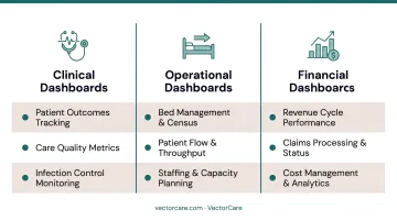
Most healthcare dashboards fall into one of three categories:
- Clinical dashboards track patient outcomes, care quality metrics, and infection control
- Operational dashboards cover bed management, patient flow, staffing, and throughput
- Financial dashboards monitor revenue cycle performance, claims, and cost management
Why Patient Logistics Needs Its Own Dashboard
Modern health systems increasingly require a fourth: patient logistics — covering transport coordination, discharge planning, and post-acute care transitions. This domain has historically been managed by phone and fax, with no real-time visibility into what's moving, what's delayed, and what's costing money.
Each of these categories maps to a distinct dashboard type, covered in the examples below.
Healthcare BI Dashboard Examples
These five dashboard types are the most commonly implemented across hospitals, health systems, payers, and post-acute care organizations — each built around a distinct set of KPIs and workflows.
Clinical Performance Dashboard
Clinical performance dashboards are used by clinical staff and quality improvement teams to monitor care quality, patient outcomes, and infection control across departments or facilities.
Clinical performance data has traditionally lived in retrospective reports — reviewed weeks after a pattern has already formed. A real-time dashboard surfaces metrics like readmission rates, hospital-acquired infection (HAI) rates, and average length of stay (ALOS) as they develop, enabling early intervention rather than root cause analysis after the fact.
| Category | Detail |
|---|---|
| Key KPIs | Readmission rate, ALOS, HAI rate, patient satisfaction score, mortality rate |
| Common Use Cases | Monitoring post-discharge outcomes, tracking infection spikes, benchmarking care quality by department or physician |
| Primary Users | Chief Medical Officers, clinical quality teams, infection control nurses, hospitalists |
Operational Efficiency Dashboard
Operational efficiency dashboards are designed for hospital administrators and operations managers to track bed utilization, patient flow, staffing levels, and throughput across the facility in real time.
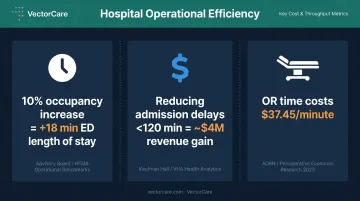
Operational bottlenecks are often invisible until they cause harm or revenue loss. ED overcrowding, surgical delays, and staffing gaps don't announce themselves — they build undetected until they become crises. Research cited in a 2024 review found that a 10% increase in hospital occupancy correlates with an 18-minute increase in ED length of stay, and that reducing admission delays to under 120 minutes could generate nearly $4 million in net annual revenue for a typical facility. An operational dashboard makes these dynamics visible before they escalate.
| Category | Detail |
|---|---|
| Key KPIs | Bed occupancy rate, average discharge time, OR utilization rate, staff-to-patient ratio, surgery cancellation rate |
| Common Use Cases | Managing patient flow during peak hours, reducing OR downtime, optimizing staffing schedules |
| Primary Users | Hospital administrators, operations managers, charge nurses, OR coordinators |
One cost benchmark worth tracking: research published in JAMA Surgery found inpatient OR time costs $37.45 per minute. Every avoidable delay, cancellation, or scheduling gap carries a direct dollar figure — making OR utilization one of the highest-value metrics an operational dashboard can surface.
Financial & Revenue Cycle Dashboard
Financial and revenue cycle dashboards are used by finance departments and billing teams to track revenue performance, claims processing, and cost management across the organization.
Revenue cycle problems are rarely obvious in real time. Claim denials, aging receivables, and reimbursement gaps accumulate across thousands of transactions before they show up in month-end reports. A financial dashboard connects billing, reimbursement, and cost data in one view, making denial patterns and AR trends visible while there's still time to act.
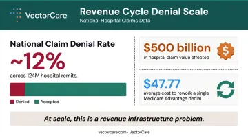
The scale of the problem is significant. According to the Optum 2024 Revenue Cycle Denials Index, national medical claim denial rates held at approximately 12% in 2023 — across roughly 124 million hospital claim remits valued at $500 billion. A 2023 Premier Inc. survey of 516 hospitals put the average administrative cost to rework a single Medicare Advantage denial at $47.77. At scale, this is not a billing problem — it's a revenue infrastructure problem that a well-designed dashboard directly addresses.
| Category | Detail |
|---|---|
| Key KPIs | Claim denial rate, accounts receivable days, net revenue, cost per treatment, reimbursement rate, operating profit margin |
| Common Use Cases | Monthly revenue cycle reviews, denial root cause analysis, payer contract negotiations |
| Primary Users | CFOs, revenue cycle managers, billing departments, finance directors |
Patient Logistics & Transport Dashboard
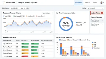
Patient logistics and transport dashboards are purpose-built for transfer centers, hospital case managers, and patient logistics teams to track the real-time status of transport requests, dispatch efficiency, on-time performance, and coordination across providers — including NEMT, ground ambulance, and air medical.
Patient logistics is one of the most data-rich and least-visualized domains in healthcare operations. Delays in transport coordination directly extend length of stay, create bed holds, and drive preventable readmissions. The AHA reported that ALOS for patients discharged to post-acute care settings increased nearly 24% from 2019 to 2022 — a trend that transport delays actively worsen.
Yet most transfer centers still manage these workflows through phone calls and spreadsheets, with no real-time visibility into what's moving, what's delayed, or which providers are underperforming. A logistics BI dashboard addresses this directly by surfacing transport request volume, average response times, on-time performance, and provider-level metrics — converting an unstructured coordination problem into a measurable, manageable workflow.
VectorCare's Insights module is designed specifically for this use case. It generates operational dashboards tracking performance metrics, bottlenecks, and demand patterns from structured logistics data — with vendor performance scorecards, on-time rate tracking, and facility-level reporting available without custom development. The platform currently serves more than 2,500 healthcare facilities nationwide.
| Category | Detail |
|---|---|
| Key KPIs | On-time transport rate, average response time, transport request volume, broadcast acceptance rate, manual coordination hours saved |
| Common Use Cases | Managing interfacility transfers, tracking NEMT and air transport SLAs, measuring dispatch automation performance |
| Primary Users | Transfer center managers, case managers, patient access coordinators, hospital operations teams |
Population Health & Value-Based Care Dashboard
Population health dashboards are used by payers, ACOs, and risk-bearing provider organizations to track high-cost members, social determinants of health (SDoH) factors, quality measure performance, and utilization patterns across a defined patient population.
Value-based contracts require proactive population management, not reactive episode response. Organizations that can identify rising-risk members and care gaps before they generate claims are structurally better positioned to perform. CMS reported that Medicare Shared Savings Program ACOs generated $2.48 billion in net savings in performance year 2024 — evidence that data-driven population management at scale produces meaningful financial results.
The SDoH data layer is where many dashboards fall short. HHS ASPE analysis found that socioeconomic factors alone may account for 47% of health outcomes, while clinical care accounts for approximately 20%. A population health dashboard that doesn't surface housing instability, food insecurity, and transportation barriers is missing nearly half the picture.
| Category | Detail |
|---|---|
| Key KPIs | PMPM cost, readmission rate, high-cost member cohort size, SDoH prevalence, quality measure scores, care gap closure rate |
| Common Use Cases | Chronic disease management, network strategy, HEDIS/STARS performance, risk adjustment |
| Primary Users | Payers, ACO leaders, population health managers, care management teams |
Must-Have KPIs for Your Healthcare BI Dashboard
KPI selection should happen before a dashboard is built. Building a dashboard around the wrong metrics wastes both engineering time and user attention.
Universal KPIs Across Dashboard Types
These six metrics appear across nearly every healthcare dashboard type because they connect clinical and financial performance simultaneously:
- Patient satisfaction score — ties care quality to reimbursement under value-based contracts
- Average length of stay (ALOS) — a composite signal for discharge efficiency, bed availability, and care coordination
- Readmission rate — reflects care quality, post-discharge support, and payer contract risk
- Cost per treatment — connects clinical decisions to financial outcomes at the service level
- Claim denial rate — an early indicator of billing process failure and revenue leakage
- Bed occupancy rate — determines capacity constraints that affect every other throughput metric
Operational and Logistics-Specific KPIs
Patient flow now drives both safety outcomes and revenue — and the KPIs that track it have moved to the center of operational dashboards:
- On-time transport rate — delays in patient transport extend bed holds and drive up ALOS
- Average dispatch response time — a direct indicator of coordination system performance
- Manual coordination hours saved — quantifies the operational burden that automation eliminates
The AHA has documented a 24% increase in ALOS for post-acute discharges — a figure that translates directly into bed-day costs and reduced capacity for incoming patients. Tracking transport and coordination KPIs is how operational teams connect those delays to their root cause.
Data Quality Is the Hidden Variable
A dashboard built on incomplete or inconsistently coded data will mislead rather than inform. Before selecting KPIs, confirm that the underlying data systems — EHR, billing platform, logistics software — populate those fields reliably and consistently.
Three data quality checks worth running before finalizing any KPI:
- Completeness by segment — a 92% complete dataset fails if the missing 8% represents a specific payer or care pathway
- Coding consistency — the same clinical event must be coded identically across departments and facilities
- Refresh cadence — real-time operational KPIs require near-real-time data feeds; batch-updated fields create blind spots
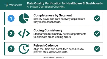
Dashboards don't fail because of bad KPI choices alone. They fail when good KPIs sit on unreliable data.
How to Choose the Right Healthcare BI Dashboard Tool
Tool selection is the last decision, not the first. Organizations that choose a BI platform before defining their KPIs and stakeholder needs end up with reporting noise rather than decision support.
Three Primary Selection Criteria
1. EHR and data system integration capability The dashboard is only as useful as the data feeding it. Tools that connect to existing EHRs, logistics platforms, and billing systems through standard APIs — without requiring heavy custom development — cut integration timelines and reduce long-term support overhead. ONC data shows approximately 70% of hospitals had FHIR-based app capabilities by 2024, making FHIR compatibility a baseline expectation for any new analytics investment.
2. User access design A dashboard that surfaces the right data to the wrong audience creates confusion. Executives need aggregate trend data; frontline staff need patient- or unit-level operational views. Confirm that the tool supports role-appropriate views without requiring separate implementations for each user group.
3. HIPAA compliance and data security For cloud-based systems, data residency, encryption standards, and Business Associate Agreement terms are non-negotiable evaluation criteria. Organizations should request security attestation documentation (SOC 2, HITRUST, or equivalent) as part of the vendor assessment.
Those three criteria cover strategic fit. The next set covers operational readiness — the questions that separate tools that work in demos from tools that work in production.
What to Evaluate Beyond the Demo
When reviewing tools, ask about:
- Data refresh frequency — does the tool update in real time or run daily batch cycles? For operational dashboards tracking patient flow or transport status, batch processing creates blind spots.
- Stakeholder configurability — can department heads adjust their own views, or does every change require a development ticket?
- Healthcare domain knowledge — does the vendor understand claims data structures, EHR architectures, and FHIR standards? A general-purpose BI tool applied to healthcare data without that context typically produces months of rework.
The most common selection error isn't choosing the wrong features. It's choosing a tool with compelling visuals before confirming it can actually connect to existing data infrastructure — a gap that surfaces only after the contract is signed.
Conclusion
The healthcare organizations making the best decisions aren't necessarily sitting on the most data — they've built clear visibility into the data they already have. Clinical, operational, financial, patient logistics, and population health dashboards each address a distinct layer of organizational performance. Together, they provide the infrastructure for faster, safer, and more cost-effective care.
For hospitals and health systems with a specific gap in patient logistics visibility, the challenge is familiar: transport coordination, discharge workflows, and interfacility transfers have historically run without any real-time data to back them up. VectorCare's platform addresses that directly, with built-in logistics dashboard capabilities backed by data from over 2,500 healthcare facilities nationwide.
The Insights module surfaces vendor performance, on-time rates, and facility-level operational metrics — drawn from millions of structured logistics transactions processed annually.
To see how VectorCare turns logistics data into decisions your team can act on, request a demo.
Frequently Asked Questions
What are healthcare BI dashboards?
Healthcare BI dashboards are data visualization tools that aggregate information from EHRs, billing systems, logistics platforms, and other clinical or operational sources into a unified, real-time view. They enable administrators, clinicians, and finance teams to make faster, evidence-based decisions without waiting for manual reports.
What is business intelligence (BI) in healthcare?
BI in healthcare refers to the use of data analytics, reporting tools, and visualization platforms to transform raw healthcare data into actionable insights. It spans patient outcomes, financial performance, operational efficiency, and population health.
How is Power BI used in healthcare?
Power BI is commonly used to build internal reporting dashboards for finance teams, operations managers, and executives — tracking KPIs like revenue cycle performance, staff overtime, referral patterns, and service profitability. It connects to EHR and billing data sources, though healthcare-specific configuration typically requires additional development work.
Is Power BI still in demand in 2026?
Power BI remains widely used across healthcare organizations for internal analytics, holding a Leader position in the 2024 Gartner Magic Quadrant for Analytics and BI Platforms. Its role is evolving alongside cloud-native platforms and EHR-embedded analytics tools like SMART on FHIR apps, which deliver analytics directly within clinical workflows.
What metrics should a healthcare operational dashboard track?
Core operational KPIs include bed occupancy rate, average discharge time, patient wait time, OR utilization, and staff-to-patient ratio. Increasingly, patient transport on-time performance and logistics coordination metrics — like average dispatch response time and manual coordination hours — are treated as essential operational indicators, not supplementary ones.
How do healthcare BI dashboards integrate with EHR systems?
Modern healthcare BI dashboards integrate with EHRs through APIs and interoperability standards like HL7 FHIR. SMART on FHIR enables analytics applications to run directly within EHR workflows. A case manager can initiate a transport request and see its real-time status without leaving the patient's chart, with all documentation written back to the medical record automatically.