Introduction
Hospitals and health systems generate staggering volumes of data every day — patient vitals, bed occupancy rates, transport requests, billing cycles, staffing levels. The problem isn't a shortage of data. It's that most of it sits in disconnected systems, forcing staff to pull manual reports, make phone calls, and piece together a picture that's already outdated by the time it's assembled.
Healthcare dashboards solve this. They consolidate data from EHRs, operational systems, and financial platforms into a single, real-time view — giving clinicians, administrators, and coordinators the visibility they need to act quickly.
A 2025 systematic review of hospital dashboards found they were associated with reduced costs, shorter lengths of stay, and meaningful staff-time savings — with some organizations reporting gains of up to 11,200 hours per year. Results vary by implementation, but the trend across organizations is consistent.
This article covers the three primary dashboard types — clinical, operational, and financial — with examples of each, plus an emerging fourth category gaining traction in modern health systems: patient logistics.
Key Takeaways
- Clinical dashboards track outcomes, infection rates, and care gaps to support earlier intervention
- Operational dashboards monitor bed capacity, staffing, and patient flow to prevent bottlenecks
- Financial dashboards expose revenue leakage and help executives manage cost performance
- Patient logistics dashboards give transfer centers real-time visibility into every active transport request
- Modern dashboards connect to EHRs through FHIR APIs, removing the need for manual data entry
What Is a Healthcare Dashboard?
A healthcare dashboard is an interactive, centralized tool that visualizes key performance indicators from multiple data sources — EHRs, billing platforms, operational systems — in one place. Unlike a static monthly report, a dashboard updates in real time or near real time, allows drill-down into specific data points, and is designed for ongoing monitoring rather than periodic review.
Think of dashboards as an intelligence layer on top of your existing systems: they collect, monitor, and visualize data for feedback, decision support, and quality improvement — without replacing EHRs or billing platforms, but making their data actionable.
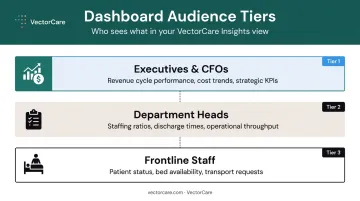
Dashboards serve different audiences:
- Frontline staff — tracking daily patient status, bed availability, or transport requests
- Department heads — monitoring staffing ratios, discharge times, and operational throughput
- Executives and CFOs — watching revenue cycle performance, cost trends, and strategic KPIs
The three primary dashboard types in healthcare are clinical, operational, and financial. A fourth — patient logistics — is one transfer centers and discharge planners increasingly rely on for live visibility into patient movement between care settings.
Clinical Healthcare Dashboard Examples
Clinical dashboards track patient care quality, treatment outcomes, and clinical efficiency. They help care teams spot deteriorating patients early, reduce preventable complications, and benchmark care quality over time.
Patient Outcomes Dashboard
A patient outcomes dashboard gives clinicians a real-time snapshot of care effectiveness across a unit or service line. It tracks whether patients are recovering as expected, flagging those at elevated risk of complications or readmission before problems escalate.
Common KPIs:
- 30-day readmission rate
- Average length of stay (ALOS)
- Patient satisfaction score
- In-hospital mortality rate
The readmission problem alone justifies this type of dashboard. AHRQ reported 3.8 million adult 30-day readmissions in 2018, at an average cost of $15,200 per readmission. A dashboard that surfaces readmission risk before discharge gives care teams an intervention window they otherwise wouldn't have.
Infection Control Dashboard
Hospital-acquired infections (HAIs) remain one of the most costly and preventable patient safety failures. CDC data shows approximately 1 in 31 hospital patients has at least one HAI on any given day — a figure that translates directly into patient harm and institutional liability.
An infection control dashboard monitors:
- HAI rates by type (CLABSI, CAUTI, MRSA)
- Antibiotic usage patterns and stewardship adherence
- Infection source tracking by unit or procedure
One real-world CLABSI bundle-adherence dashboard study found that real-time monitoring increased bundle adherence from 25% to 44%, with CLABSI carrying an average cost exceeding $55,000 per infection. Isolating outbreak sources faster — and triggering corrective action before spread — is what separates reactive infection reporting from genuine prevention infrastructure.
Emergency Department (ED) Dashboard
ED environments generate constant pressure — patient flow, triage wait times, bed availability, and diversion decisions all happening simultaneously. An ED dashboard applies real-time analytics to manage these competing demands.
Key metrics to track:
- Door-to-provider time
- ED diversion hours
- Triage-to-treatment time
- Bed availability by acuity level
Predictive analytics layers can also forecast peak admission volumes, helping administrators staff proactively rather than reactively. CMS publicly reports hospital-level ED throughput measures, so hospitals can benchmark their door-to-provider times and diversion rates directly against national data — a concrete accountability mechanism most EDs still underuse.
Chronic Disease Management Dashboard
For patients managing diabetes, heart disease, or COPD, care gaps build up gradually — missed appointments, lapsed medications, unmonitored lab values. A chronic disease management dashboard makes those gaps visible before they become hospital admissions.
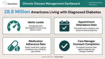
Tracked KPIs include:
- HbA1c levels and percentage of patients in uncontrolled range
- Appointment attendance rates
- Medication adherence rates
- Care manager outreach completion
With 28.8 million US adults diagnosed with diabetes and an additional 27.6% going undiagnosed, care managers using population-level dashboards can prioritize outreach and close gaps systematically — catching high-risk patients in the window when intervention still prevents an ED visit.
Operational Healthcare Dashboard Examples
Operational dashboards focus on how a healthcare organization runs — covering patient flow, staffing, resource utilization, and logistics. Department heads, operations managers, and frontline coordinators use these to act on real-time data rather than waiting for a weekly report.
Hospital Operations Dashboard
A hospital operations dashboard gives administrators a live view of capacity across the entire facility. When bed occupancy climbs, discharge times lengthen, or surgical cancellations spike, the dashboard surfaces those signals before they cascade into ambulance diversions or delayed care.
Core KPIs:
- Bed occupancy rate by unit
- Average discharge time
- Staffing ratios per department
- Surgery cancellation rate
The scale of this challenge is significant — AHA counts over 907,000 staffed beds across US hospitals. A 2024 Johns Hopkins study found that approximately 30% of patient-days experienced at least one care delay, which means operational dashboards need to track not just capacity, but why patients are still in beds when they're ready for the next step.
Staff Performance Dashboard
Nurse burnout is measurable and consequential. A national study found that 31.5% of nurses who left their jobs cited burnout as a reason — and a 2025 review found safe staffing levels were associated with a 14% reduction in hospital mortality.
A staff performance dashboard helps managers identify staffing risk before it turns into turnover:
- Staff-to-patient ratios by shift
- Overtime hours by individual and department
- Training completion rates
- Appointments or procedures completed per shift
This data supports smarter scheduling, surfaces workload imbalances, and helps leadership align staffing with actual patient demand.
Patient Logistics and Transport Coordination Dashboard
This is where operational visibility becomes directly patient-facing. A patient logistics dashboard tracks transport requests, dispatch status, response times, and completion rates across ambulance, NEMT, and air medical services — giving hospital transfer centers and discharge planners live visibility into patient movement.
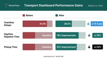
A 2024 real-time patient transport study using a Beacon dispatch dashboard reported measurable gains across every tracked metric:
- Overtime delays fell from 41.0% to 26.5%
- Daytime dispatch time improved by 78%
- Pickup time improved by 32%
VectorCare's platform delivers this type of visibility: real-time patient logistics dashboards that give hospitals and health systems a live view of every active transport request, from initial broadcast to confirmed pickup. Coordinators can monitor performance across 2,500+ healthcare facilities from a single screen.
The platform's A.D.I. (Automated Dispatching Intelligence) automates the dispatching process itself, simultaneously broadcasting requests to multiple providers and booking the optimal response based on ETA, cost, and acuity. Tasks that previously consumed 30–60 minutes per request are reduced to under 3 minutes with SMART on FHIR Epic integration embedded in the EHR workflow.
Financial Healthcare Dashboard Examples
Financial dashboards give healthcare executives, CFOs, and billing teams a clear view of revenue health, cost drivers, and the financial sustainability of care delivery.
Revenue Cycle Management Dashboard
A revenue cycle management dashboard tracks billing efficiency from claim submission to final collection. Finance teams use it to spot where revenue is leaking — denied claims, slow payer processing, billing errors — and intervene before small problems compound.
Key KPIs (HFMA-aligned):
- Days in accounts receivable (A/R)
- Claim denial rate
- Clean claim rate
- Net collection rate
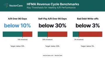
HFMA benchmarks provide useful targets: A/R over 90 days should be below 10%, self-pay A/R over 90 days should be below 30%, and bad debt or unnecessary write-offs should stay below 3% of total expected collections. Dashboards that surface real-time performance against these thresholds give revenue cycle teams something to act on daily.
Cost of Care Dashboard
A cost-of-care dashboard breaks down per-patient costs, per-procedure costs, overhead expenses, and medication costs by department or service line. This gives leadership the data to identify cost reduction opportunities without defaulting to across-the-board cuts.
Average hospital expenses per adjusted admission rose from $9,673 in 2011 to $11,383 in 2017. By comparing costs across service lines or facilities, executives can identify variation that isn't clinically justified and prioritize where to act.
Key cost metrics to track:
- Cost per adjusted patient admission
- Per-procedure costs by service line
- Overhead expense ratio by department
- Medication costs relative to reimbursement
Patient Billing and Reimbursement Dashboard
Patient repayment rates across US hospitals have been reported at approximately 54% and have declined in recent years — a meaningful cash flow risk for finance departments. A patient billing dashboard monitors:
- Outstanding patient balances by age
- Average payment times
- Insurance reimbursement rates by payer
- Billing dispute trends
This view helps finance teams proactively manage collections and build more accurate cash flow forecasts, rather than discovering shortfalls at month-end.
Key Benefits of Healthcare Dashboards
Operational Efficiency
Dashboards consolidate data that once required hours of manual report-pulling into a single, always-current view. The 2025 systematic review of hospital dashboards found positive studies reporting staff-time savings ranging from 132–198 hours per year to as high as 11,200 hours per year, depending on the organization's complexity and the scope of implementation.
That time doesn't disappear — it shifts to patient care.
VectorCare's A.D.I. alone saved healthcare system customers more than 100,000 hours in 2025 by automating the manual dispatching work that previously consumed coordinators' days: sequential phone calls, manual vendor matching, follow-up on unanswered requests. The compounding effect at scale is substantial.
Earlier Clinical Intervention
Real-time visibility into patient status, readmission trends, and care gaps enables earlier interventions. When a dashboard surfaces a rising HAI rate, a cluster of high-risk readmissions, or a pattern of delayed discharges, care teams can act before an adverse event occurs.
The CLABSI bundle-adherence dashboard example illustrates this well — increasing adherence from 25% to 44% through visibility alone, at an average infection cost of $55,000 per case. The dashboard doesn't treat the patient; it closes the gap between what staff know and what they can act on.
Financial and Strategic Performance
Dashboards give executives and department heads the data to make confident decisions about staffing, resource allocation, and contract negotiations. For organizations in value-based care models, this matters even more — quality outcomes and cost performance are contractual obligations, not just operational goals.
A qualitative study on value-based healthcare dashboards found that cost categories like care activities, resources, income, and financial viability need to be surfaced explicitly to support value improvement decisions. Well-designed financial dashboards make those categories visible in real time, giving decision-makers a clear basis for action.
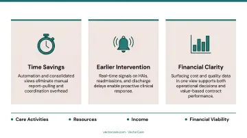
The three benefit areas above each point to the same underlying mechanism:
- Time savings: Automation and consolidated views eliminate manual report-pulling and coordination overhead
- Earlier intervention: Real-time signals on HAIs, readmissions, and discharge delays enable proactive clinical response
- Financial clarity: Surfacing cost and quality data in one view supports both operational decisions and value-based contract performance
Frequently Asked Questions
What is a dashboard in healthcare?
A healthcare dashboard is an interactive visualization tool that aggregates data from clinical, operational, and financial systems into a centralized view. It allows healthcare professionals to monitor KPIs and make informed decisions in real time, rather than waiting for periodic reports.
What are the different types of dashboards in healthcare?
The three primary types are clinical (patient outcomes and care quality), operational (patient flow, staffing, and logistics), and financial (revenue cycle, billing, and cost). Specialized dashboards — such as patient logistics dashboards for transfer centers and transport coordinators — are increasingly common in modern health systems.
What KPIs should a clinical healthcare dashboard track?
The most important clinical KPIs include readmission rate, average length of stay, patient satisfaction score, hospital-acquired infection rate, and care plan adherence. The right set depends on the care team's specific role and the patient population they manage.
How do real-time dashboards improve patient outcomes?
Real-time dashboards surface deteriorating trends — such as rising infection rates, delayed discharges, or missed follow-up appointments — before they escalate. This gives care teams an intervention window that static reporting doesn't provide, reducing preventable complications and avoidable readmissions.
What is a patient logistics dashboard used for?
A patient logistics dashboard gives hospitals, transfer centers, and transport coordinators live visibility into transport requests, dispatch status, and provider availability. It replaces manual phone-based coordination with real-time tracking across multiple providers and transport modalities from a single view.
How do healthcare dashboards integrate with EHR systems?
Modern healthcare dashboards connect to EHR systems through standards like SMART on FHIR, enabling automatic data extraction from patient records without manual entry. ONC reported that 73% of digital health companies now use standards-based APIs for EHR integration, reflecting how broadly this approach has been adopted across the industry.